
|
03/25/2012 Your Frontier Online Bill
We have been receiving spam and junk mail from Frontier for the past month or so about their wonderful "New, Better Bill Design". What a joke! It looks like it was designed by my favorite scapegoat, the drunken fourth graders. I have been using electronic bill formats for several years now and I have to say this design really and truly S U C K S !
|
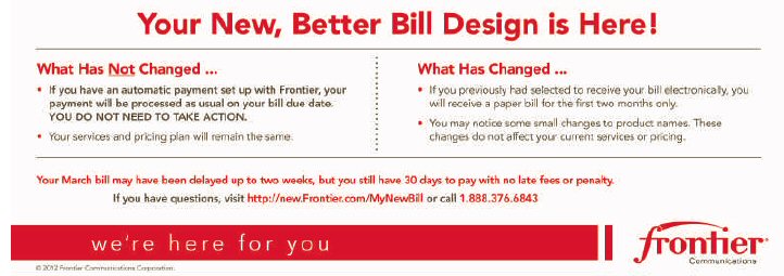
| The old format was a simple black & white format that was easy to read even without magnification. And anyone who does much of anything on the Internet knows that red and white isn't the best choice. I have to think this design was originally made for printed paper and then poorly reproduced for the Internet electronic bill web site. On top of the horrendous blurry red images they have put a bunch of advertisements all over the darn thing to boot. It's bad enough I have to get their bill but I have to put up with badly designed ads too? I had to send Frontier's Customer Service a nearly nasty email telling them to fix this monstrosity so it is easier to read.
I told them this is NOT the kind of thing a technical company should represent themselves with —— so FIX IT! |